22.12.10

WATCH THE TITLE: SE7EN

I love title sequences since I first was aware of their existence. It was 1995, I was in Barcelona, hoping to watch the last Brad Pitt film (I was young, don't hold it against me). I got to the cinema, a few commercials, some trailers (which I'm a big fan of too) and then the film started. And I watched Se7en opening credits, hypnotized by music and images that were building up my engagement with the film from the first second. That was the perfect start for the film that came after and the style and technique used became a big influence in visual culture.

After that day, I never have watched a film again without paying great attention to the opening and closing credits and while feeding my interest I have found a website that claims "forget the film, watch the titles" in which you can spend hours watching their 147 titles and reading the interviews with designers working on the field. 

My friends, highly recommendable: WATCH THE TITLES

Ole!


18.12.10

HERB LUBALIN: COMMUNICATING WITH TYPE

I think Herb Lubalin is a designer to look at for logo design inspiration, or if you are interested in communication through typography. I found his Mother & Child and Families logos amazing and his ITC Avant Garde typeface is iconic. You can read a bit about him here.

Ole!


15.12.10

AIRSIDE KNOWS HOW TO DO IT

In 1998 Alex Maclean, Fred Deakin and Nat Hunter founded AIRSIDE, a creative agency from London that does graphic design, illustration, digital, interactive and moving image. With clients such as Coca Cola, V&A, Apple, Virgin Atlantic and Greenpeace, the portfolio shown in their web page it's full of creativity and innovative solutions with a description of each project brief, their approach and the result. Have a look as well to their blog, inspirational.

Ole!


12.12.10

Let me in VS Låt den rätte komma in

Last Friday I went to the cinema to watch Let me in, the American remake of the Swedish film directed by Tomas Alfredson in 2008, and based on the novel by Swedish writer John Ajvide Lindqvist, Låt den rätte komma in (Let the right one in). I was thinking to write about the two films, questioning myself about the need to remake a 2 year old film, on the differences between European and American cinema and about  the strengths and weaknesses of each movie but then I thought that even being interesting it was a kind of analysis that didn't really matched my blog's purpose. 

I would like to talk, instead, about the posters that have been used to promote both films and to lure the audiences to go and watch them.

This is the original poster of the Swedish version from 2008,  a composition of images creating a collage feel. A man hanging upside down from a tree, a shadow that seems to be pushing from inside the poster, the little illuminated window and the kid inside, all the elements work together giving a feel of horror and darkness but as well purity and hope. The title, in sans serif, white, centered type sitting on the middle of the poster. I think it's definitely appealing, it sells the movie mystery and darkness. Simplicity on the layout that let you concentrate on trying to decode the image.
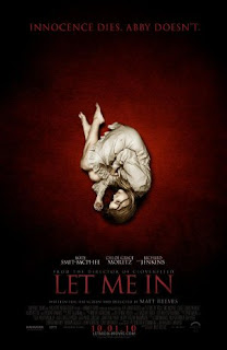
The original poster of Let me in, the American remake from 2010. Classic film poster layout, an striking image of an extremely pale young girl in a fetus position in contrast with the red blood background, lots of mystery and darkness here as well. But the typographic treatment it's completely different. A light serif typeface has been used and, by choosing red, the title becomes more difficult to read. They have felt the need to add some copy at the top of the poster that, in my opinion, seems unnecessary however I like how the type emerges from the background.

I think both posters are successful but I'm probably more keen on the Swedish version. More interesting, communicating but not telling you as much as the Let me in poster.

I post here the international posters for both films, can we find a pattern?

Ole!


10.12.10

NEW YORK MAGAZINE: INFOGRAPHICS

Reading the Creative Review blog I come across a post about the infographics featured on the New York Magazine. Lately, while designing a PDF to present my design process in the first University project,  I have developed a high interest in this kind of visual communication, the visual representation of data, information and knowledge it's a difficult art that the New York Magazine seems to master, Chris Dixon's team make infographics look effortless and simple (when they are not), easy for the reader to follow and understand the content.

Ole!


7.12.10

FIRST TERM IS FINISHING

Today I'm handing in all my work, it's the end of the first term and it has been an amazing experience so far, I'm enjoying my course as a child with a new toy, becoming a bit of a design nerd (if I have to be honest). I feel I'm learning so much that it's difficult to put it into words, my visual awareness it's sharper and my design process has been, finally, born. I understand better how creativity works and I have now the tools to keep improving my skills. I need to learn so much still that I feel really motivated to start the new term and, with a bit of focus in my time management skills, I'm sure I'm gonna take as much as I can from this year.

Getting ready for the crit.

Ole!


6.12.10

SOME MORE COLLAGES

I'm gonna spend my evening doing the rest of the 100 collages that I have to hand in tomorrow, I have about 15 left, so hopefully I'll be able to go to sleep in some point... Here is a selection of some of them.


CREATIVE AGENCIES TALKS

A few weeks ago I had the amazing opportunity to spend the day visiting POKE,LBi and DIGIT,three of the most important creative agencies in London, I had access to their offices and sat in their boardrooms were the creative directors talked to us (a group of students from different Colleges) explaining what they do, their working philosophy, what they looking for when recruiting and lots more of interesting stuff.

Since I started to be interested in develop a Graphic Design career I wasn't that kind in working in an Agency, I found LBi and DIGIT people really interesting but after the chat with one of POKE founders, Nick Farnhill, I started to feel exited with the idea of working with a group of people so full of energy and motivation. 

I took some pictures that show some bits of my visit, I highly recommend you to have a look to their portfolios (they are pretty impressive).

OLE!


                  POKE WALLS


                         POKE WALLS


                          DESIGNERS AT WORK IN POKE


                          LBi LOVELY RECEPTION 


                          LBi HAS A GREAT ENVIRONMENT TO WORK


                           LBi WALLS


                          DIGIT INTERACTIVE GRAFFITI