24.5.11

MONOPRINT

Monoprint it's a really easy and quick technique that we were shown in one of the workshops. I think is a bit difficult to get exactly what you think you want for the final image but, in another hand, maybe the beauty comes, sometimes, from the unexpected. I used photography and my own drawings to create representative images and I experimented with abstract as well. One chapter less to go!!

Ole! 


23.5.11

REDUCTION

This chapter is about simplify visually something that it's already quite simplified, a London Street Map. I have done two typographic maps, one from East London and the other from the South Bank. These are walks that I found really stimulant and inspirational. I think that as a Graphic Designer you can walk around these areas enjoying extremely interesting visual culture, I must admit that there is a lot of places as interesting in London, but the walk by the River, stopping on the Tate Modern and finishing with an amazing lunch al fresco by the Church in Borough Market, or to get lost (better when sunlight) in the small streets surrounding Brick Lane, with the people, the street art, a salmon and cream cheese bagel... its a pretty amazing experience every time.

Ole!


21.5.11

REPETITION 2

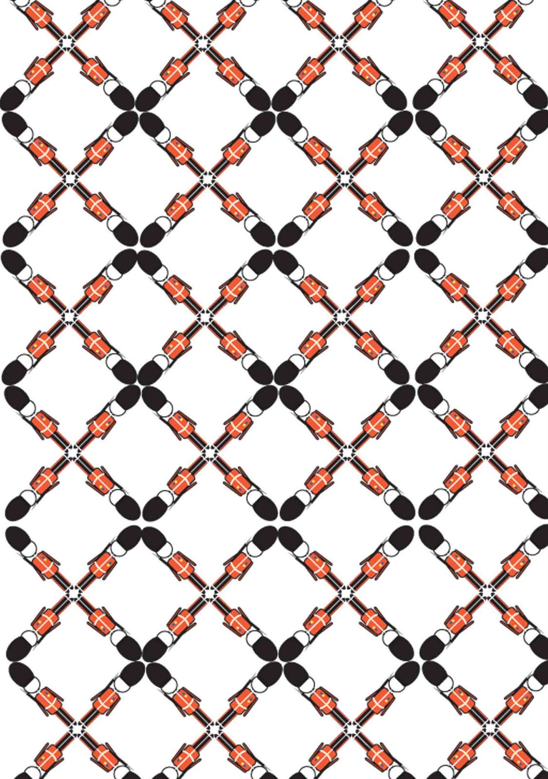
I wasn't too happy with my development of the repetition workshop and I decided to push it a bit further, I have designed a few wallpapers. I wanted to keep using cliches as a theme, I have drawn London landmarks, based in simple geometrical shapes, and I have combined them in patterns that make difficult to isolate their basic unit. Finally I could not help myself and I  have made a wallpaper where you can clearly appreciate the drawings, it may be a bit more obvious than the rest but I like it. 

For the book, and to explore the principle of interruption I will use colour in a random way in some of the pattern elements.

Ole!


19.5.11

REPETITION

Another chapter that I have been developing lately it's based in the principle of repetition, the workshop it's called repetition/interruption, but when we did it we worked mainly with pattern. My first approach was to take pictures of pattern around London but I didn't think was taking me nowhere. I changed direction and wanted to create pattern with the use of an image that represented a London cliche. I took a photograph of an old London bus and cropped it creating patterns until I found a good unit to play with. After, I used photoshop to manipulate and change its colors, I would like to go a step further and create my own London inspired wallpaper.

Ole! 


18.5.11

SYMBOLS

Here is the result of my exploration of symbolism, we had freedom to interpret it as we wanted but during the workshop it was lots of information and visual examples of pictograms and isotype. Based in my experience in London I wanted to design pictograms indicating the weather by showing you what to wear. I thought they could be use on their own or combining them (if the weather it's enough crazy to require it). I must admit that they are directed to the female population, as I think we tend to get more annoyed if the weather surprise us not ready for the occasion but I'm thinking that I could develop them (having a bit more time in my hands) male oriented, or even unisex.

Again, the execution has been a fight between me and my computer but finally I got them done.

Ole! 


16.5.11

SILHOUETTES

Following with the development of the chapters of my London research book I just finished the one called silhouettes. We were asked to experiment with illustration using clip art, shadows or silhouettes. It has proved quite challenging for me because I'm still quite new in Illustrator, but I managed to do a few illustrations with different styles.

Ole!


15.5.11

LAYERS

I'm working on my course's Final Major Project. Under the title "Seeing London through the Eyes of a Designer" we have to explore different Graphic Design principles using London as a theme. We have developed a number of workshops and we are expected to generate images based on them. The first workshop I have been able to finish is the one called layers.

I have been taking photographs of the things that more excite my eye in this incredible city full of contrasts and contradictions. By overlapping different components from these photographs I have create images characterized by the use of different layers, colours and textures.

I didn't want to over-think it because, as I don't have been briefed with a message to convey and communicate, it seems more productive to focus on composition, colour or aesthetics. On the workshop we where taught to use bitmap and duetone in Photoshop and, so far I just have used this technique because I really need to improve my Photoshop skills and this is a really good opportunity.

These images are definitely going to my research book, I'm pretty satisfied that they are completely created by me from top to toe.

Ole!